Friday, 11 December 2009

Final Stamp Designs

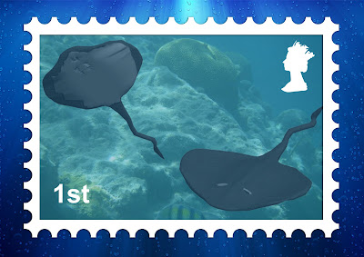
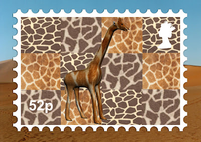
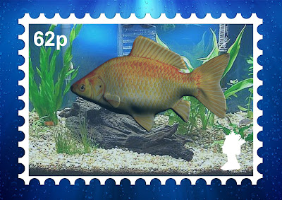
Here are my final 3 Stamp Designs. Im extremely proud of them and very happy with how they have come out.


I believe that they all have good bits and I feel that with a lot more time and experiance using 3DS Max they could be improved.
I had never used 3DS Max or any form of 3D software but have enjoyed it lots and cannot wait to start using it again in Semester 2. At the beginning of the course I was a bit worried and a bit dumbstruck because there are so many different options and tools. After looking at a few online tutorials and attending Richard's lectures I began to get a lot more confident with the software and was able to produce some pretty good work.

Thanks for reading my blog of my first semester using 3DS Max.
Stamp Model 3 - Stingray

I had now created 2 previous models, both I felt had very strong points but also had weak points. I decided that I would try and bring all my skills gained this semester and use them on this final model and in my personal opinion this is my best model overall. But then again I suppose I am biased but I'll let you make your own opinions on it. This post is in the same format as before. My final renders are posted first then the step by step guide.


I started off by creating a simple flat box with a number of segments so that I could edit the vertices. I then cut this box in half and added the "Symmetry" modifer. I moved the vertices around until I got a shape that resembled that of a Stingray. With the Symmetry on it looked more liek a Stingray.
I then added a turbosmooth modifier.

My next job was to create the main body of the Stingray. The main body of the stingray is located pretty much in the center of the animal. There is a large lump that not many people notice and inside of this lump is a stingray's version of the human digestive system.

I extruded the top layer of polygons in the centre upwards. I kept doing this until it was of sufficient height and then moved aroun some of the vertices to get the correct shape. It was just a bit of trial and error until I was satisfied.

A key thing to note is that I also create a lip around the edge of thhe stingray. When feeling a stingray you notice that the edge of its body is actully lipped so i moved the inner polygons down to give this affect. I think its worked quite well actually.
I was now going to add the stingrays eyes, which are on the top of its head. I did this by extruding some polygons inwards to get the eye shape when it was turbosmoothed.

I then used the same method on the underside of the Stingray for it nostrils and mouth.

I was now ready to work on the gills of the Stingray. They work in a very similar way to how they work on a fish but the Stingray just has more of them. A regualr Stingray is born with 10 of them but of course in some crazy cases across the world there have been different amounts.

I used the same method that I used for the Eyes, Nostrils and mouth by extruding polygons inwards. The only problem I had here was that I obviously needed a lot of polygons to extrude and also I needed a gap between then. This meant that on either side to just cover the gills I was going to need at least 9 polygons so that the spaces in between would work. To accomplish this i used the "Cut" tool, which I had used in both previous models and was now conifdent with. I started on the underside of the Stingray and ended up on top after going around the edge. It is important to have your cuts go in a big loop to improve the quality of the turbosmooth.
My next move was to make the tail for the stingray. Most people don't think about the tail of a stingray because of the so common large flounder like shape that everyone immediately associates with a Stingray. The "Sting" of the Ray actually comes from the tail and is the most dangerous part. You may use this information if you were unaware of this and come up against a Stingray in the future!!!!

I started off by turning my half a stingray into a full stingray. This is done by having the "Symmetry" modifier on and selected all of the model, right clicking and converting it to an editable poly. This elimiates the symmetry modifer and welds the two parts together into one big stingray. I then used the extrude tool to pull a tail out of the back of the stingray. I Extruded the main body of the tail at first and then used the vertices and Lines angles to create a more realistic shape for a tail.

My Stingray with its Pointy end to the tail and its jagged tail.

Most images of a Stingray's are taken when they are swimming. When they are taking up this motion the far ends of there wing like features extend up in the air and go down to propell them along. (It is hard to explain but if you look on my moodboard or on most images on the Internet you will understand me.) I wanted to add this idea onto my Stingray so began moving the vertices up in the air on both sides.

The Stingray, right before texturing.

I now had a finished Stingray that was ready to be textured. I was extremely happy with how it had turned out and felt it was a very good representation of how a Stingray looks. I also felt that the small features like the wings in the air, the lipped edges to the body and the main body hump in the middle of the animal made it look a lot more realistic.

In the same way that I had done for the goldfish, I applied the UV Unwrap modifier to the model and spent some time peicing the smaller pieces onto the larger ones to get an image that could be used for texturing.


Once I had pieced the bits together I placed the iamge into Photoshop so I could begin working on the materials.
I used the Internet to find an image of a stingray's skin that I could use on my model. Below is the texture that I found.

Once I had the stingray skin, I began working on the the image. The whole of the top side was going to be covered in this skin so that was pretty simple. On the udnerside the center part was going to be white however I had noticed that most stingrays topside material bends round and covers up some of the underside but at random stages. I tried to incorporate this into my image.

The big white splodge is covering the tiny pieces of the stingray. These were the gills and the innerds of the mouth,nose and eyes. I wanted these to be white and thought it would be easy to cover them this way. The top right part of the texture is covering the tail. The point of the tail was painted black but it will not show up in this image as the background is black.
I then added the material to my Stingray and I was extremely impressed with how it looked. I played about with the amount of texture that covered over the white colour on the bottom of the stingray. I just kept editing the amounts until I was happy with how it looked.

Below are my final Images of my Stingray. I took one of the top and one of the bottom so you cans ee the effect on both sides.

With the disaster that had happened with Goldfish texturing I was ever so happy with how the texture came out on the Stingray. With te final texture added I decided to add a "Bump map" to the model, a technique that Richard had showed us in one lecture. I used the same image that I had used for the material and I think it made such a greate difference and really made the texture come to life and look realistic.

This is the skin with NO Bump Map on it.
This is my final Skin for the Stingray that DOES have a Bump on it. I think it looks tonnes better and makes the model look more realistic.
I really enjoyed creating the Stingray. There were similarities between the Giraffe and the Goldfish but neither are similar to the Stingray so I had to start from scratch with no ideas. I tried to use skills that I picked up in the other two models and used them in this model. I hope you like it because I am very happy and proud of it especially with the texturing.

Stamp Idea 2 - Goldfish

My second stamp model is going to be a goldfish in a form of underwater scene. I thought that this would be a good challenge to create a goldfish as every fish is different in the real world so I would be able to do myne how i wanted. As in my previous blog post, my final render is at the top here and then a step-by-step guide goign through the process to making it with a bundle of screenshots.
I decided that i was going to create this model a bit differently to the Giraffe. I had seen a lot of people using reference images to actually create the model whereas I just used images to look at for my Giraffe. I thought I would attempt this method and see how it goes. I started off by finding an image that had the kind of shaped goldfish I was looking for. I then created a large plane in the scene, which i added a basic material to. I edited this material by adding the bitmap of my goldfish image as in the picture below.

Once my plane was added, I then created a second plane on top. This was going to be my actual Goldfish model. Its crazy how a finished 3d model was going to appear from starting with just a plane. I placed the plane over the center of the image and then extrude the plane left and right until it covered the whole image. It was important to keep stopping Extruding and then restarting as this would create seperate sections, which would be used for modelling the actual outline as showed later.
After the plane covered the whole body, I edited the vertices of each section so that they fitted over the main body. I chose to make the main body shape first and then work on each of the fins as I believed it would be easier.

I needed to make my body have vertices along the middle of its body so that I would be able to manipulate them in order to create the fatness of the body. To do this I started at the head of the body and selected the "Cut" tool. I then created a line going from the centre of the head to the opposite end of my model. I repeated this a few times above and below this line trying to keep a sort of parrallel line with my edge linees for ease in the future.

I was now ready to give my body a rounded shape. To do this I needed to select all the vertices, stretch them out to side a bit, then deselect a few around the edges and then repeat the process. This would eventually end up with the middle vertices being the furthest out on my fish and the ones around it nearly as far but a bit behind. When the turbosmooth is added this will create a rounded affect.

It was going to be very much a case of trial and error because I was working with one side of the fish. It would not be until I had finished stretching it out I could use the "Symmetry" modifier and see what the overall fish looked like. My first attempt is shown below and as you can see I stretched out a tad too far and ended up with more of a puffer fish.

My second attempt was a lot better and would allow me to move onto the next stage when it was completed.
I was now going to work on the back fin. I used the vertices and lines at the back end of the body and started to extrude them across the fin giving me some more Polygons to work with. I then edited the vertices over the top of the image to get the correct shape.

This was after the back fin was complete.

I wanted to see what my fish looked like with the back fin and the fatness on the body. I re-added the "Symmetry" modifier and moved around the different angles to see the image.

I then continued with making the outline of the fish and moved onto the top fin. I used the same process as the back fin to create the shape. I then moved onto the over two fins in the same way.
I now wanted to create the small fin that is positioned just behind the head. I struggled at first with this part because I was not sure how I was going to create the actual shape extended off of the body. I had a couple of attempts at doing it but unfortunately my vertices and lines kept on overlapping, which created total mayhem when turbosmooth was applied.

The way I eventually worked of doing it was to pick a polygon where I thought was about right for the fin. I then extruded this out away from the body to a suitable distance. I then took the edges of this polygon and extruded them down the body. I repeated this process a few times and now had a rectangle along the side of the body to work with. From this point it was simple as I just modified the positions of the vertices to create the shape. When the turbosmooth was added I checked to make sure nothing had overlapped and all was good.

I was now ready to make my fish into a complete fish and not two seperate halves. i started off by editing the position of the mirror in the "Symmetry" modifier. This allowed me to bring the two halves of the fish together as shown below.

The one problem with this was the as you can see, where I had extruded the fish out earlier, it now had caused a gap on parts of the body and back fin.

To fix this I spent a lot of time going over the fin and pushing the vertices back together making sure they did not overlap. This took a long time but it was a silly error by me that had caused in the first place so I saw it as Karma.
My next problem was that my fish had a seem down the middle of its body where the two sides of the fish had been pushed together. I wasnted to eliminate this and had found on the Internet that the best way to do this was to select all the middle vertices when the fish was put together and weld them together. I had used a simlar process with some of the vertices on the fish where i used the "Target Weld" method.
Once this was all done, my fish now had a completely roudned shape and the fin and body were all joined together perfectly. My only problem was now I had a gap at the front of my fish where I needed to put the mouth. I moved some of the vertices around, used the "Target Weld" function to push some together and in general just played about with the vertices to get a form of frontal fish look. I then moved 3 of my edges toether and move the middle one into the body. This then created the effect of the mouth as shown below.
I was now ready to add in the eyes. I did this by extruding a polygon inwards around where I thought the eye would be placed. I then created a seperate object of a small sphere and moved it into this now created hole. I used this method so that the eye did not look seperate to the body and now had a form of eyesocket. I think it worked quite well in the image below.

I had now completely created my 3d fish and I was extremely happy with what I had done. Seeing as it was my 2nd model I though it was superb. I now had the task that was putting materials on to make it look more like a goldfish.

As I mentioned in my Giraffe blog post, many people int he class and on the same course had started to use "UV Unwrap" modifier. This would allow them to build a flat model of their finished model, which could then be exported into Photoshop or such like and have individual materials and colours added. This is a superb method because it allows you to put a range of different affects on each area. So I thought I would give this method a try.

I started off by adding the "UV Unwrap" modifier to my goldfish. I then flattened the map of it out. You now have to move the individual parts of the model together in a flat form so it can be easily modified after. The image below shows my Unwrap and how it had started to be put together. The finished article was then rendered into Photoshop so it could be worked on.
I now was able to add my scales and fins to the goldfish. I was going to use the image I originally used for my plane and as reference to add the scales and fins to my fish. This took hours to do because I wanted to make sure that the person viewing the fish would not be able to see where bits had been placed together. I went through and worked on the main body, the udnerside of the fish, each of the fins individually and then most of the time was spent tidying it up to make it perfect. Conitnuity was key here because as i said earlier I did not want anyone to be able to pick out where I had joined certain image parts together.

I pretty much had now completed my Unwrap and was able to add it to my fish. Ive added this image at this stage below and I think it looks superb even with my original doubts.
Unfortunately this is where the enjoyment stopped for me because I came across a big issue. Where I had flattened my image I was able to see the whole image on 1 level. This was fine for most of the body but when it came to sorting out the head I had a problem. I was able to add the head to the side of the body with no problems but then when i looked at the front, the mouth was in trouble. Due to the way the mouth was created, there was a very large amount of small polygons used on the front. This meant that when it came to unwrapping the model, there were a lot of smaller pieces that really couldn't be attached anywhere because it would ruin the model. I wasn't sure what to do really so I sat about and had a think of how I could fix this.
My plan was to restart the UV Unwrap, push the images together better so I had a much more sensible image to use to edit in Photoshop. So as much as it hurt to do so I did this and went through the same methods as before. I was now going to push the two sides of the fish more together on the UV Unwrap as shown in the image below. I would then place the whole Goldfish iamge on top of the unwrap because I had seen a few other class members using this idea and I thought it would work well. So I spent some time working on this unwrap, putting the fins onto the model etc however I came across a big issue that I STUPIDLY had not thought about.

When I had previously done all of my unwraps, my eyes were still in place so there were some polygons missing from the overall shape to make room for them. When I placed the whole fish image on top of the Unwrap firstly there was going to be a random gap where the polygons had made way for the eye socket and secondly my fish was now going to have 4 eyes, the 2 that i created and the 2 from the image placed on top). I tried going back to the original model and deleting the eyes and eyesocket and returning it to its normal state. Unfortuantely in doing this I had to basically delete my UV Unwrap. When I tried to go backk to my map, it had been reset with the new shape and I was going to have to re-do all of the unwrapping. At this point I had to consider what would be best with the short time I had left.
I decided that I felt my model was superb and the main part of the assignment was the actual model so I decided I was not going to waste too much time going back on the materials. I was disappointed that I did not have anything on the fish so it just looked like The Hulk at the moment. I considered different things I could do and decided that I was going to add the image I used as a reference, as a material. I could then add the material to the model and see how it looked. The image i used for the material is below.
I was very surprised with how this turned out but surprised in a good way. I felt that the material worked well, not brilliant but was still okay BUT my model remained the same, which I think was the strongest part of this model. My final render is shown below.

I enjoyed creating the goldfish and believe the model that I created is one of the best bits of work i've ever done. I gave the UV Unwrap a try but unfortunately in this instance it did not work as well as I had hoped but hey, at least I gave it a try. I will definitely be trying it again in my 3rd model.

Thursday, 10 December 2009

Stamp Model 1

My first design that I attempted was going to create was the Giraffe. I thought about creating a Giraffe as I had a Good idea of how I could create certain parts of it. Below is my final render of the giraffe model and then beyond that is an explanation of how I came to get this model with some screenshots to make it more understandable.

I started out with a simple box, which i converted into an Editable Poly so the edges could be rounded like so.

I used the "Extrude" tool to extrude polygons out of the original shape. This created the two legs on the near side


I did the same thing for the legs on the far side and then for the neck. To get the correct angle for both the legs and the neck, I used the Vertex and Line tools in my editable poly and angled tem accordingly. I also used the same idea for the tail although it was a bit harder as I needed it to come off of the original shape and then extrude downwards. To do this I firstly used the "Chamfer" tool, which takes a vertex and creates a polygon from it. This then allowed me to Extrude the polygon out of the centre of the body. I kept Extruding and Angling my vertices so that I got the desired shape.
I used the same method as before to create a head shape. Yes at this moment it did look very much like a deformed dinosaur but I was going to stick with it and see. I angled my lines and vertices to enable me to change the direcion my extruded shape would come off from the neck.
I rounded off the front of the head to make it a bit less blocky once the turbosmooth was used. I then started to create the ears. From looking at images of giraffe's, I noticed that the ears came out of the side of te similarly to a human but were built in stages. The first stage was a sort of connection between the head and the ear lobe. This was created as shown below.

The next stage was to further Extrude the shape and make the actual Ear Lobe. I moved the vertices as I extruded so that I could get a rounded shape that looked more like an ear.
The other thing I noticed about Giraffes is that on the top of their heads, they have two lumps. These reminded me of the way a camel has 2 humps on its back whereas these were a lot smaller and in the centre of the Giraffe's head. I simply used the Extrude tool again to create these.
I then played about with the position and angles of the vertices and lines around the mouth. At the moment there was no mouth whereas I obviously wanted one so played about with the angles and let the Turbosmooth do a lot of the work if im honest.
After creating the mouth I then moved onto the eyes. I was a bit puzzled about how I was going t do the eyes because a Giraffe's eyes are actually on the side of its head whereas most animals, including humans, have them on the front. I was able to use the "Chamfer" tool once again to create a polygon on the side of the head but was angled enough that it was still visable from the front. I then used te Extrude tool again but this time I pushed the polygon inwards to create a small hole where the eyes would be.
I used the same method on the front of the head for the nostrils. This Giraffe really does look angry in the image below but trust me he is not :).

My next task was to deal with the tail. I had created the tail earlier and had got the shape and angle that I desired however I had noticed that a Giraffe has a small bushy hair area at the end of the tail. I was aware that there was a "Hair and fur Modifier" built into 3ds Max so I thought I would investigate and play around with it.
I started off by looking online for some tutorials to see what and how some of the tools were used. I found a couple on the Internet but none really stood out and helped me greatly so I thought the best way to learn would be through trying. I added the modifier onto the tail and went through all te different options. Funnily enough I learnt some great things that you can do wit the modifier that I will definitely use in the future but unfortunately no matter what I tried I was unable to get a bushy tail affect I tried combing the hair into place, cutting the extra hairs away, increasing the hair count, increasing and decreasing the amount of hair segments and randomness, editing the area it attached and I even added a 2nd Hair and fur Modifier to see if it would increase the bushyness. I decided that the model looked a lot better without te hair because it was too wavey and looked very unrealistic and in my opinion, pretty poor. I decided that I was not going to keep it on the model but took some screenshots to show you all what it did look like.
After a bit of disappointment with the bushy tail, I now moved onto the texturing and materials of the Giraffe. I had seen that classmates had started to look into using a UV Unwrap to complete their textures. As this was my first model in 3ds Max, I decided that I would simply stick to adding materials. I looked on the Internet for a nice image of a Giraffe skin and added it to my maters. I played about with a few of the settings to get it how I wanted it to look. I then added a bump map of the same image to make it look more detailed, which in my opinion it did make a big difference.

I then created a material that could be used for the hooves of the Giraffe. This was then simply added in the same way as before to the lower Polygons of each foot. A simple method but in my opinion makes a big difference.
I decided that with the disappointment of the Hair and fur Modifier on the tail that I would like to use it for the small crest of hair down the giraffes back. I used the techniques I had gained from playing about trying to get the bushy tail and placed a small amount of light brown hair along the crest of the giraffes back. Personally for not being taught about the hair and fur modifier, I think it has come out pretty well.


So there is my final render of my Giraffer. Formy first model in 3ds max of this standard, I was extremely happy with how it turned out. More detail could be put into the amterials to get a wider range on the animal. I think the hair works well on the back of the Giraffe but I was very annoyed about the tail. Oh well, I guess thats life.........